- Oh I love this a surprising amount. Also a good reminder of some of the dividends of vibe coding -- this would have been an extremely useful tool for at least two decades of web designers if published in the early 2000s. Even now for a type nerd who is not a designer, it was fun to play with -- really cool.
- Thank you so much! I am from that era, and I remember, a few of these types of interfaces existed back then.
I was still in college at the time and used to be fascinated by how painstaking it was to build such UI in photoshop, and then putting everything in nested HTML tables to achieve this. Everything was rudimentary, CSS was in its nascency and everything broke in Internet Explorer 6
- The thing it makes me wonder is why we need vibe coding to create such an app --- why can't there be a nifty RAD tool for web development like to VB6 which makes this sort of thing easy and natural --- I expected LiveCode to become that, but they never seemed to get any traction w/ their HTML5 Canvas implementation.
SpiderBasic might be usable thus, but I've yet to find a nice graphical IDE which ties into the code in a fashion which makes sense to me.
- I'm such a sucker for skeuomorphism... got chills clicking and turning those knobs
- Thank you so much. I'm glad you liked it!
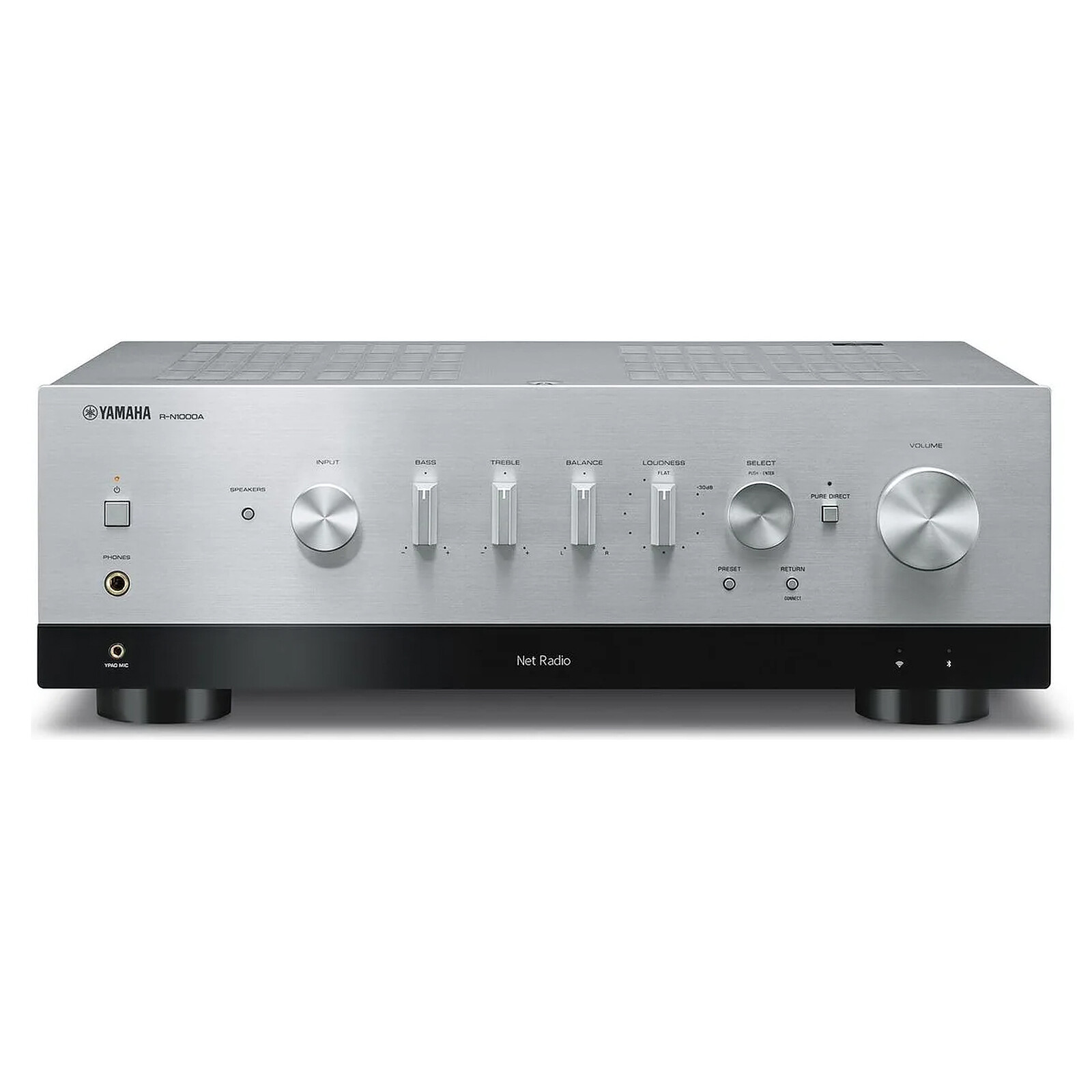
- Speaking of vintage audio interface with a modern touch, I love my stereo amp: a Yamaha amp with the old look of the Yamaha amp from the 80s, but with also a tiny OLED display on the bottom, "hidden" in a black band and that only shows fonts in blue (imitating an old monochrome seven-segment display or something).
Yamaha R-N1000A:
https://media.ldlc.com/r1600/ld/products/00/06/27/71/LD00062...
It is a thing of beauty. One could lament that the knobs are good looking but just cheap plastic knobs and not, unlike back in the days (at least on some models), actual metallic knobs.
It's a fully integrated amp with ethernet, a modern DAC, many input sources, room correction, etc. but it looks like a hi-fi component pulled straight of an 80s stereo stack.
P.S: there's also the same amp but with vu-meters and a bit more powerful etc. but then it gets really pricey
- I got a similar looking Stax amp (the SRM series). Also quite satisfying. It has a split volume dial so that you can adjust the volume of each channel separately.
- oh no I summoned the audiophiles by talking about knobs and chills :D
just kidding, looks dope
- This is one of the most beautiful things I have seen in such a long time. The numeric sliders, the color pickers, the analogue numeric displays, such a great great interface. I wish more and more things were this beautiful.
- Thank you so much, your comment inspires me to create more of these!
- Author here. Thank you very much for the kind words!
I'm a product designer and a design engineer and I love tactile interfaces and typography.
My goal was to challenge myself to build this purely by 'describing' the interface to an LLM, without giving it any image references. Being mosly working in Figma / Sketch for the past decade or so, the process was utterly painful and I craved to go back to Figma to polish and correct the interface, but I persevered and described the UI to the LLM and progressively built the UI.
The stack is Next.js / React / Zustand with zundo for undo/redo, Clerk for auth. I also made the LLM write 60-odd unit tests and playwright tests running against production. It was AI-assisted throughout.
chrismorgan's critique below is mostly correct. Thanks a ton! The eyebrow one is a straight bug. Base range 8 to 32 is indefensible. Word spacing shouldn't be a control at all. Those three are getting fixed today.
- the export button actually being useful is the difference here, most of these type scale tools are fun to play with then you have to manually rebuild everything anyway. gonna steal this workflow for setting up type styles before I even open framer
- Love it , I am using it , thanks
- Some remarks. The entire thing ends up feeling tasteless to me: it has a whole bunch of knobs (metaphorical and for a change pseudo-physical), half of which shouldn’t exist and some others which should being missing, with terrible calibration, poor defaults, and just… it lacks a certain je ne sais quoi.
Various factors make me suppose this is low-effort vibe-coding, but I make this response anyway for the potential benefit of others.
• Modular type scales are harmful nonsense. I wrote about it in more detail a few years ago in https://news.ycombinator.com/item?id=36000879. They’re often presented as virtuous, but they actually produce arbitrary, bland, inferior results, mediocre at best.
• The range of base sizes is excessive. I think everyone should agree there’s no point in offering below 14px (8px!), and I wish everyone would agree beyond 24px is madness (32px!). Personally I recommend 16px on small screens, up to a maximum of 18–20px (or if you must, 22px) on large screens.
• Styling all heading levels the same is not a great idea. Yes, I know you have per-element overrides. Encouraging people to treat them the same is not wise. h1 especially is too often not treated differently enough from h2–h6. Sometimes I blame HTML for that, because despite its name, it’s not a heading, it’s the page title. Varying weight, and often varying size massively, between titles and headings and different-level headings, tends to be better than just using an anaemic modular scale with single steps. But there I go on that again…
• The auto-balancing button does some sensible things that show the nature of some of the other problems.
• Changing letter-spacing on headings (as is done by default) is a tad dubious.
• Changing letter-spacing on body text, and word-spacing on any text, should never be done; yet this option is offered.
• For “eyebrow” (interesting term, searching suggests it’s well-established yet somehow this is the first time I’ve come across it), 0.2em letter-spacing is definitely excessive. https://practicaltypography.com/letterspacing.html suggests 5–12% (0.05–0.12em). Incidentally, the per-element overrides doesn’t seem to know about that 0.2em, claims it’s at 0.
• I pressed random preset a few times, got some obviously bad results; e.g. Grand Hotel + Lato has a heading font with significantly smaller metrics than the body one, and where the negative letter-spacing is particularly bad, and where bold is not great. Significantly more than half the time, I strongly disliked the pairing. They felt completely random, even though it felt like half of the presets shown in the list were fine.
- Author of the tool here. Thank you very much for your detailed review. I appreciate the time and effort to go through to provide elaborate critique.
- The eyebrow one is a straight bug and I'm glad you caught it.
- Base range 8 to 32 is excessive, agree.
- Per-element overrides existing doesn't help, if the thing that loads first establishes uniformity. I'll fix this too
- About the the tracking, you're right that flat -0.02em across h1 to h6 is wrong. I think the proper fix is to make it size-aware
- I'll fix and curate the pairs more, and aim for half of what I have now.
- It's interesting that I disagree with all of these points.

49 points by jasim 8 days ago | 18 comments